
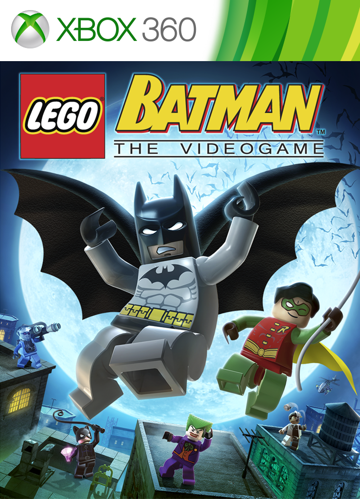
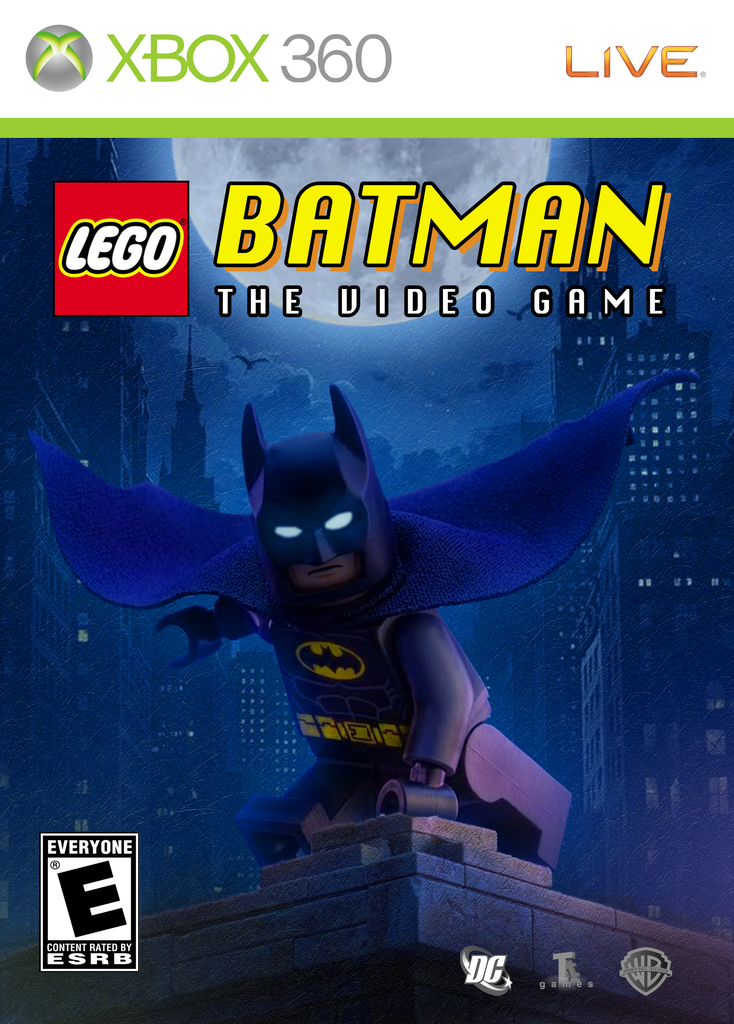
The goal of this project was to find a form of visual communication and re-design it from the ground-up and print it. I decided to focus on redesigning the LEGO Batman video game cover for Xbox 360. My goal was to create a cleaner design with better contrast, readability, and visual focus.
I started by analyzing the original LEGO Batman cover. I found that the background had too many details and characters. This made the design feel busy. I also used the newer LEGO Batman game cover as inspiration for my redesign.
I used Adobe Photoshop to combine images from Pinterest. With layer masks and colour adjustments, I created a dark, nighttime Gotham City. I chose deep blue tones for the background to make the yellow Batman logo and title stand out. This helped create a consistent colour palette and improved the title’s readability.
One of my biggest challenges was preparing the cover for print. During test prints, the dark colours made Batman difficult to see. To fix this, I adjusted the brightness and lighting. I also added a glowing effect to Batman’s eyes to make him stand out against the background.
The redesigned cover makes Batman the main focal point. Unlike the original, it removes distracting characters and background details. The controlled lighting creates a cinematic atmosphere and guides the viewer’s attention toward Batman and the title.
Although the new design is more minimal, this was a deliberate choice. The simpler background makes the cover easier to resize without losing important details.
Overall, this project helped me improve my Adobe Photoshop skills. I learned more about image compositing, layer masks, and colour correction. I also learned how important test printing is when designing for print.